
Is Your Homepage Design Helping Visitors Take the Next Step?

Updated: Jun 1

A homepage is often the first impression a business makes. If visitors can’t quickly understand who you are, what you offer, and what action to take next, you risk losing potential customers before they ever explore the rest of your website.
Many business owners think a website update is only necessary when a site looks outdated. In reality, some of the most valuable improvements happen when a business has grown and its website needs to better support its customers.
A great example of this is a recent project I completed for Highest Speak, is a public speaking and communication program that helps students in grades K–12 build confidence, strengthen leadership skills, and become more effective communicators.
Small changes in layout, messaging, navigation, and visual hierarchy can dramatically impact how users interact with a website. The refreshed homepage creates a more modern appearance while improving usability, strengthening calls to action, and supporting business goals.
Here's a look at the homepage before and after the refresh.

Three Signs Your Homepage Design May Need a Refresh
As businesses evolve, websites often need to evolve with them. Here are three signs it may be time to refresh your homepage:
1. Visitors Struggle to Find What They're Looking For
If customers frequently call, email, or message with questions that should be easy to answer online, your website may not be guiding them effectively.
2. Your Services Have Expanded
Many businesses add new offerings over time. What worked when you launched may not work as well today if your programs, services, or audience have grown.
3. Customers Aren't Sure What to Do Next
Every homepage should provide clear pathways for visitors. Whether that's scheduling a consultation, registering for a program, or requesting more information, the next step should be obvious.
A Great Website Doesn't Need a Complete Overhaul
One of the things I enjoyed most about working with Highest Speak was that they already had a strong brand, a great reputation, and an incredible mission. The goal wasn't to reinvent their website—it was to make an already successful organization even easier for families to navigate.
As their programs expanded, there was an opportunity to simplify the user experience, improve navigation, and create clearer pathways for parents exploring their options. We focused on organizing information in a way that helps families quickly identify programs that fit their child's age and goals while making important opportunities easier to discover.
Sometimes the most impactful website improvements come from thoughtful refinements rather than a complete redesign.
Highlighting Opportunities for Families
A website should do more than share information—it should help visitors connect with the opportunities that matter most to them.
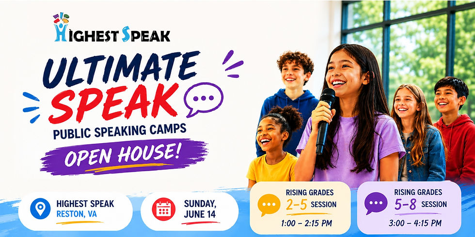
One of those opportunities is the FREE Ultimate Speak Open House on June 14, where families can meet instructors, participate in sample activities, learn about summer programs, and experience the Highest Speak approach firsthand.
👉 Learn more about the Open House: https://highestspeak.com/open-house/
Highest Speak also offers free student assessments, giving parents valuable insight into which programs may be the best fit for their child. Providing resources like these helps families make informed decisions and creates a welcoming first step into the program.

Summer Camps That Build Confidence
Another highlight of the refreshed website is the focus on Highest Speak's summer camps.
These camps help students strengthen public speaking, leadership, storytelling, teamwork, and communication skills through fun, interactive experiences designed to build confidence and real-world communication abilities. More importantly, they help students build confidence that extends beyond the classroom and into everyday life.
👉 Explore Summer Camps: https://highestspeak.com/summer-camps/
By making these opportunities more visible and easier to find, families can quickly discover the programs that best meet their needs.
What Business Owners Can Learn From This Project
The Highest Speak website refresh is a great example of how strategic updates can improve the customer experience while staying true to an established brand.
A website doesn't need to be completely rebuilt to make a meaningful impact. Sometimes the biggest improvements come from simplifying navigation, clarifying messaging, highlighting key services, and creating a smoother path for visitors.
A website homepage is often the most visited page on a site, making it one of the most important tools for guiding visitors toward becoming customers.
If your business has grown, expanded its offerings, or simply hasn't reviewed its website in a few years, it may be worth asking a simple question:
Is your homepage helping visitors take the next step?
If you're not sure, I'd be happy to help evaluate your website and identify opportunities to improve the user experience, strengthen your messaging, increase engagement, and better support your business goals.
At CAT Creative Solutions, I believe great websites should do more than look beautiful—they should work beautifully, too.


Comments